HealthSense AI
A unified platform that turns complex health data into clear, actionable insights for patients.
A unified platform that turns complex health data into clear, actionable insights for patients.
1 Day
Figma
Illustrator
Lovable
UI/UX Design
Visual Design
This case study showcases my end‑to‑end design process for creating a inspired by Function Health, Apple Health, and modern preventive‑care systems. The platform consolidates medical records, labs, imaging, vitals, device data, and lifestyle insights into a single calming, empowering, and insight‑driven experience. My role spanned .
Patients often receive medical data that feels overwhelming, clinical, and hard to interpret. With information scattered across multiple systems, it’s difficult to understand trends or make sense of what’s important.
I designed a unified patient platform that brings all health data into one clear, calming experience. It visualizes trends, explains results in simple language, supports imaging review with doctor comments, and offers AI-assisted insights to help patients understand their health with confidence.
Created modular components:
• Summary cards
• Trend charts
• Multi‑view lab explorer
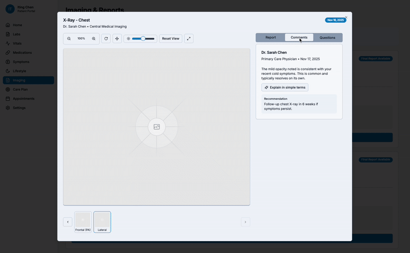
• Imaging viewer (with annotations + doctor comments)
• Question panel
• AI insights panel
I established a visual language that feels:
• Calm
• Rounded
• Emotionally reassuring
• Designed AI features with strict safety rules:
• No diagnosing
• No predicting disease
• All explanations tied to doctor‑provided notes
• Always paired with clinical data transparency
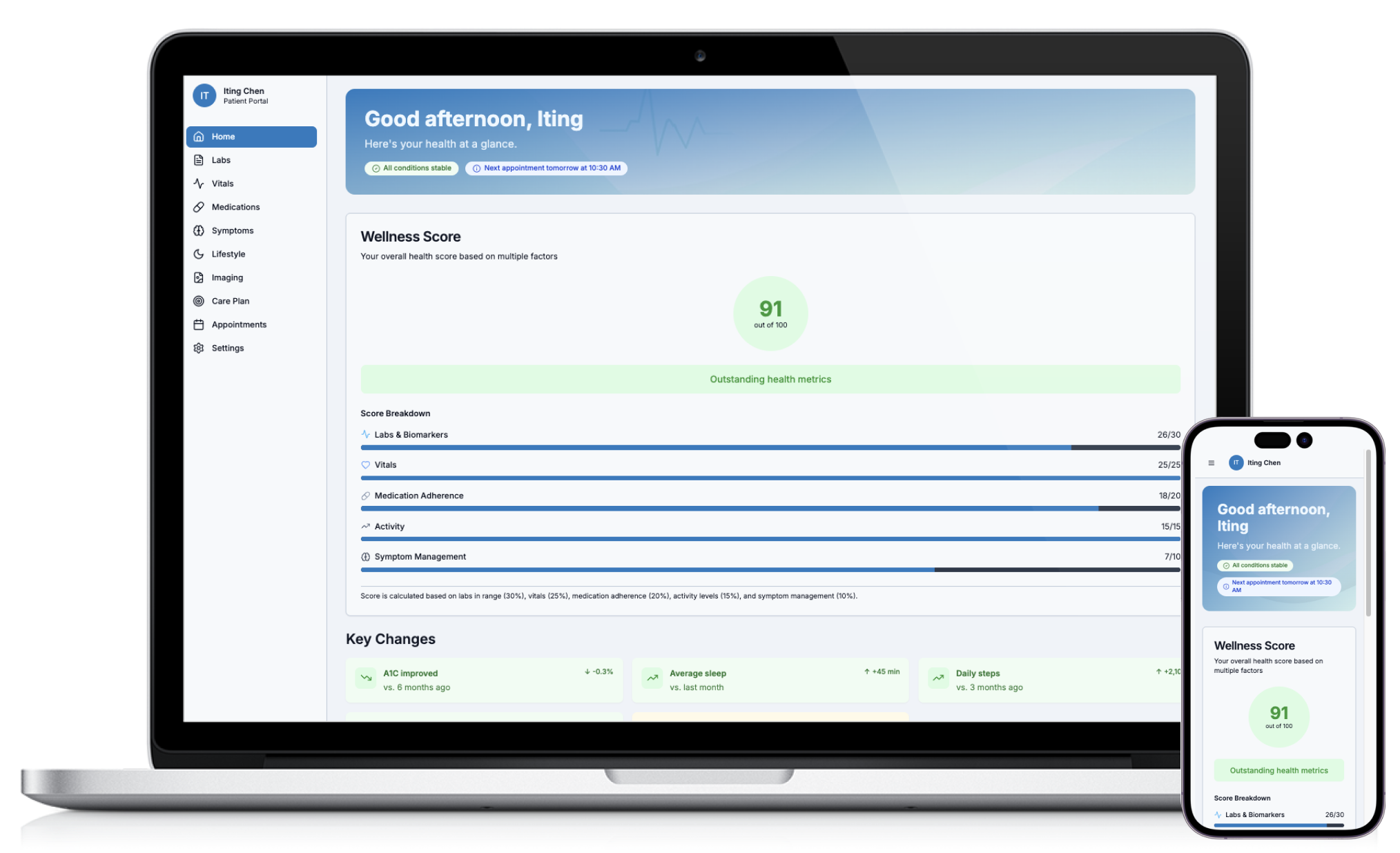
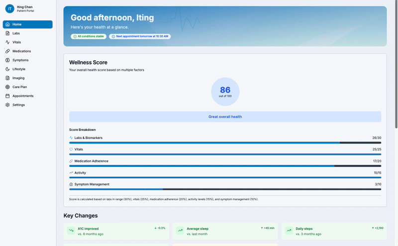
A calm, insight-driven home screen that brings together the patient’s most important health information • labs • vitals • medications • AI insights • upcoming appointments • all in one clear, actionable snapshot.
A structured Labs page that groups related panels (CBC, CMP, Lipids), highlights result status at a glance, and lets users dive deeper with trend charts, doctor notes, and AI-simplified explanations.

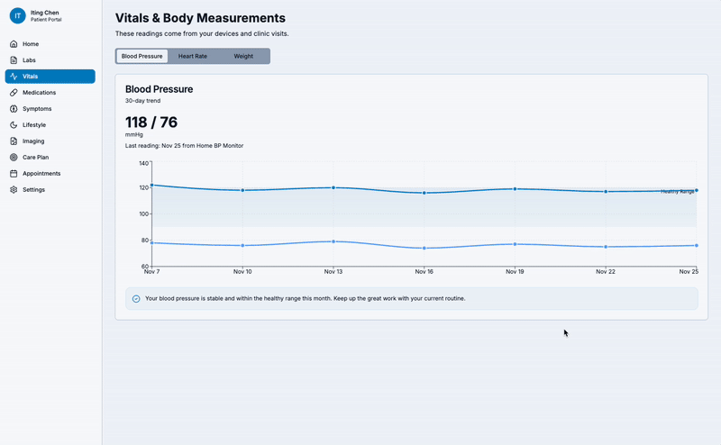
A simple, clinically grounded visualization system that turns raw vital signs into clear trend lines, normal ranges, and easy-to-read insights. Each vital (BP, heart rate, weight) features a 30-day trend chart, device source tagging, and a friendly interpretation to help patients understand what the numbers mean.
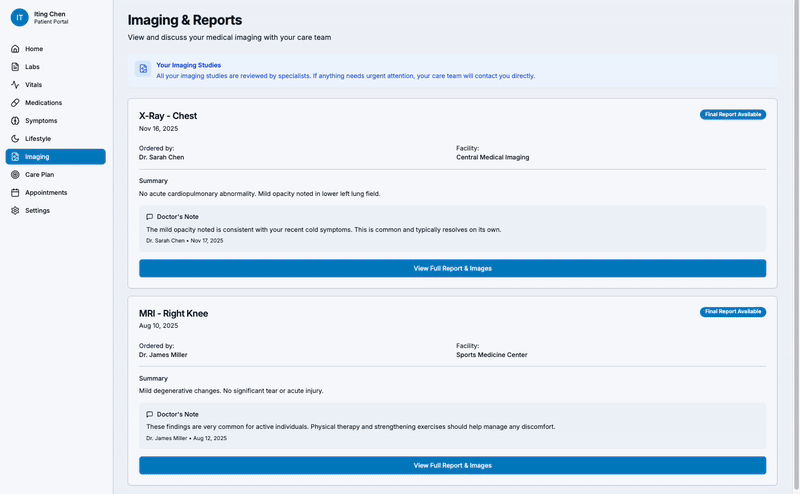
A patient-friendly imaging viewer with zoom, pan, and brightness controls, doctor-annotated findings, and AI-assisted explanations. Users can review their scans, read clinician comments, and ask follow-up questions—all in one place.
This platform makes medical data easier for non-experts to understand through clear visuals, simple explanations, and AI-generated insights. It reduces anxiety around labs and imaging, highlights important changes, and helps patients ask better questions during appointments.
I learned how to simplify complex medical information while maintaining accuracy, and how to design AI features that support understanding without diagnosing. This project strengthened my approach to emotional-safety UX, clear communication, and trust-focused healthcare design.